
ONLINE EDITION!
PRINT
DIGITAL

YOUR HOME - INTERIOR LOOKS
The Meaning of Color
July, 2008 - Issue #45
 |
Color is powerful and can have both physical and emotional effects on the people who drink it in. Before selecting your next color palate, consider how a room is used; what the primary activities will be done in the space; and your goals for what you'd like the area to emotionally convey.
Here's a rundown of the most popular interior home color families. Use this guide wisely, but don't forget: the best color for a room is the one you like the most!
Blues
The blue family ranges from a delicate baby-powder shade reminiscent of a nursery all the way to a navy "power" suit - and everything in between.
Emotional message: Blue inspires relaxation, which might explain why it also tends to enhance conversation and decision-making abilities.
Physical effects: Exposure to blue has been shown to lower blood pressure; calm over-active children; and decrease respiration.
Perfect for: Bedrooms and sitting rooms.
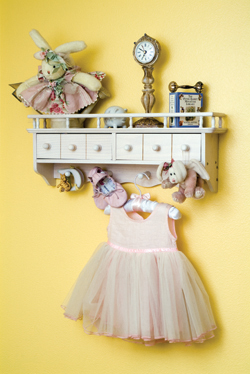
Yellows
"Sunshine" and "Candlelight" are some of the most popular paint shades this year, and with good reason. The peppy shade is full of get-up-and-go energy.
Emotional message: Just like exposure to real sunlight, seeing yellow can relieve depression. It also is associated with increased awareness, clarity and understanding.
Physical effects: Yellow has been said to stimulate appetites and improve memory.
Perfect for: Kitchens and playrooms.
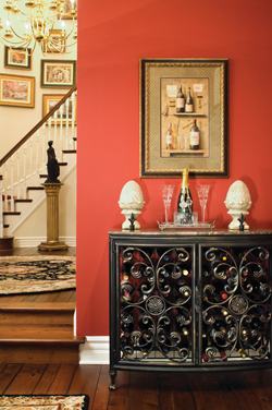 |
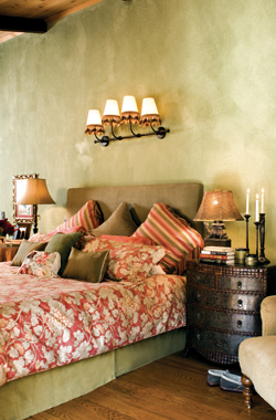
Often considered a "dangerous" color, both for its boldness and difficulty associated with finding "the perfect" red, this shade is best used strategically and in small amounts. A little red goes a long way.
Emotional message: Red conveys energy and confidence. It's also associated with royalty.
Physical effects: "Seeing red" doesn't have to translate to anger, though the color has been shown to increase the heart rate.
Perfect for: Accent walls.
Oranges
This juicy shade is a natural for any room related to food, but its ability to encourage impromptu smiles should put it in strong contention for any family-friendly space.
Emotional message: The citrus hue practically demands a happy demeanor. It also makes an independent, confident statement full of energy.
Physical effects: Orange has been shown to encourage sociability and stimulate the appetite.
Perfect for: Dining areas and family rooms.
 |
The color primarily associated with nature, green can't help but be associated with lush landscapes.
Emotional message: Green's greatest gift is the sensation of balance, but the soothing shade is also related to renewal, control and peace.
Physical effects: Expect to experience a strong feeling of relaxation, as well as a reduction in depression.
Perfect for: Study areas, bedrooms and sitting rooms.
Whites
To be accurate, white is actually not a color at all. Still, its significant use in design, as well as its heavy symbolism, make it a must-consider for any interior home palate.
Emotional message: Every bride knows that white conveys purity, love and loyalty. It also stands for new beginnings.
Physical results: White promotes the purification of actions and thoughts, as well as a desire to reduce physical (and emotional) clutter.
Perfect for: Nurseries.

|
||||||||||||||||||||||||||||